Getting Started
Artifactz.io serves as an efficient conduit, linking Docker and Java artifacts with various stages in the Software Development Lifecycle (SDLC) through a pair of cohesive components:
- APIs: Tailored to facilitate CI/CD pipeline plugins in recording or querying artifact version details at specific SDLC stages.
- Web Application: An interface that mirrors select API functionalities, allowing users to manually modify or query details and manage application configurations, tenant specifics, and system users.
More on registering a new tenant, the initial tenant administrator, and configuring supported CI/CD plugins is available in the Getting Started Guide.
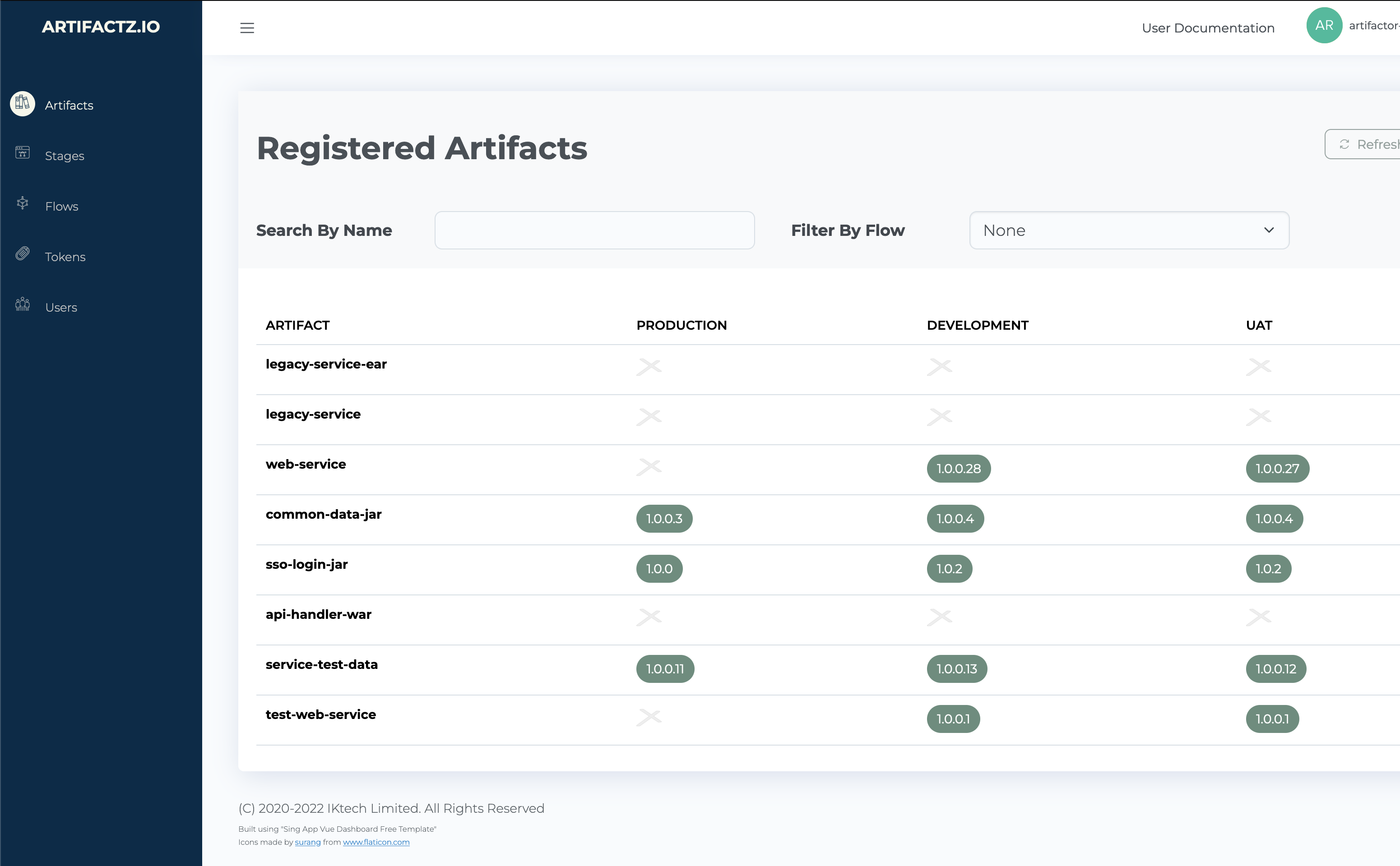
Upon login, users are greeted by the primary screen:

It unfolds into three principal segments:
- Sliding Menu (Left Hand Side): This navigation bar allows users to traverse through various system areas. In its
- collapsed state, only icons remain visible. Hovering over or clicking the triple-bar icon at the top-left reveals
- more extensive options, with each icon leading to a distinct system area.
- Main Area: Positioned to the right of the sliding menu, this space is subdivided into two key zones:
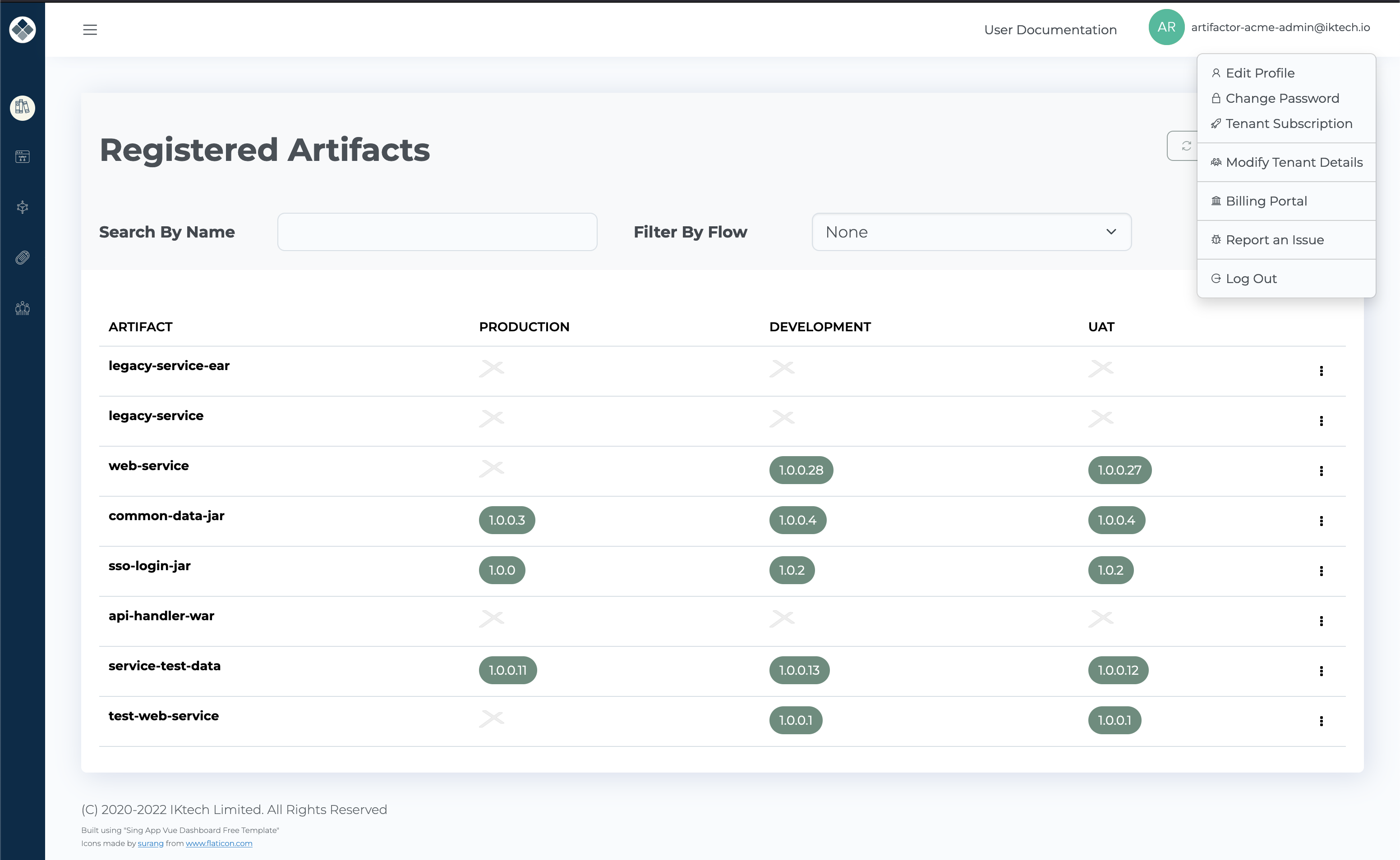
- Top Bar: Housing the user drop-down menu, accessible via the username or icon in the top-right corner, which, when clicked, unveils user-specific options.
- Main Functional Area: The central hub where specific, user-driven actions and data management are executed, complemented by clearly demarcated titles and control features.
User Drop-Down Menu is accessible via the username or icon in the top-right corner, revealing user-specific options when engaged.

Selecting from the user options typically overlays the main screen with a pertinent dialog box.
The central functional space, with its prominent title, serves as the hub of operations.
Just below the title, a controls area harbours functional controls like search input, filter, refresh, and add button, while the primary display usually showcases a table of items. Each line culminates in a context menu, symbolized by a triple-dot icon, providing access to additional actions. If a single function is available, it is directly placed at the line’s end.
Dive Deeper into Functional Areas:
Manage Your Account:
Tenancy Management: